02
Home Page
2 Homepages Available, more are. Multiple layouts and styles
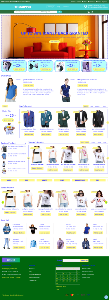
E-commerce Homepage
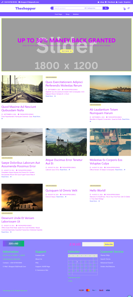
This homepage features a simple and user-friendly design, showcasing popular products and special offers at the top. With a category-based product section, responsive slider, and attractive deal banners, it encourages users to explore and shop.
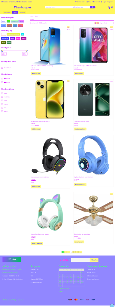
This homepage provides an interactive and engaging experience. It includes large banners for special promotions, a latest arrivals section, and customer testimonials. Ideal for highlighting flash sales or limited-time deals.
Shop Page 06
All shop pages Available For Theme Theshopper
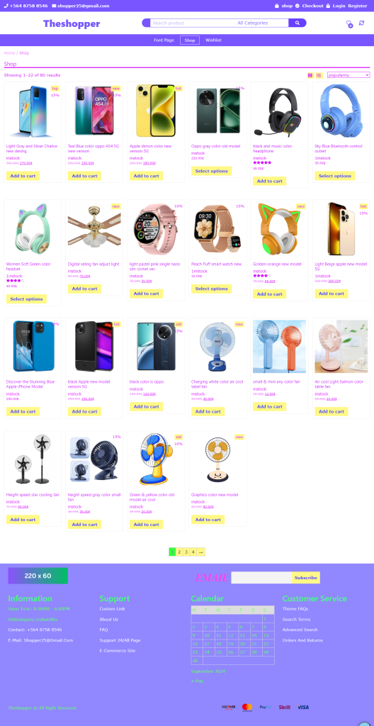
Shop 5
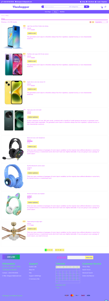
Shop 6
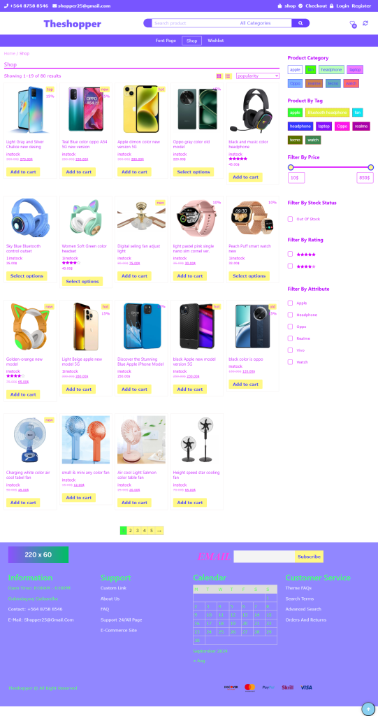
Shop Page Description
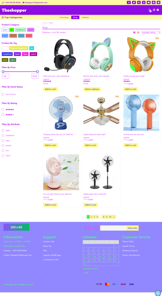
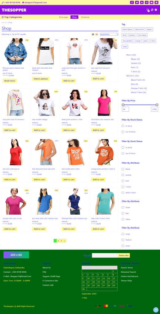
This versatile shop page layout is designed to enhance user experience with various display options:
List View: Displays products in a detailed list format, including images, descriptions, and prices. This is ideal for users who want specific information before making a purchase.
Column Options: Supports 2, 3, 4, 5, and 6 column layouts, allowing users to choose how they prefer to view the products.
Sidebars: Features sidebars on both sides, with the left sidebar showcasing custom categories, tags, best-selling products, and featured items for easy navigation display.
No-Sidebar Option: Users can select a no-sidebar option to maximize screen space for product visibility.
Custom Category Design: The sidebars highlight custom categories with appealing visuals, facilitating quick access to different product ranges.
Tag Design: The tag section is clean and organized, allowing users to click on tags to explore related products.
Best Selling Products: A dedicated section for best-selling products highlights the most popular items, helping customers discover top-rated products quickly.
Featured Products: The featured products section showcases select items, providing users with recommendations and special offers.
Single Product Page 03
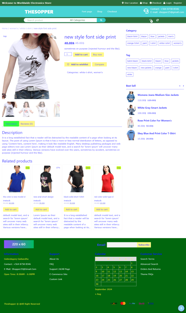
Single Product Page Description
This single product page is designed to enhance user experience with the following features:
Sidebars on Both Sides: The left sidebar displays custom categories, while the right sidebar showcases tags, best-selling products, and featured items for easy navigation.
Custom Category Design: An attractive design allows quick access to various product categories.
Tag Design: Tags provide users the option to view related products easily.
Best Selling Products: A dedicated section highlights popular items, helping users discover top-rated products.
Featured Products: Selected items are showcased as special offers and recommendations.
No-Sidebar Option: For a streamlined experience, a no-sidebar option maximizes product visibility.
Header Layout
01

02

03

04

Header layout
1. Logo
The logo is an essential part of the header that represents the brand’s identity. It is usually located on the left side of the header and often links back to the main homepage when clicked.
2. Navigation Menu
The navigation menu contains links to various sections of the website, such as “Home,” “About,” “Services,” “Contact,” etc. It allows users to easily navigate to different parts of the website.
3. Search Bar
The search bar helps users quickly find the content they need. It is typically located in the center or right side of the header.
4. Call to Action (CTA) Button
This button encourages users to take a specific action (such as “Buy Now,” “Sign Up,” etc.). It is often positioned on the right side of the header or near the navigation menu.
4. Subcategories
- If applicable, categories can be divided into subcategories for more detailed organization (e.g., under “Electronics,” there could be “Mobile Phones,” “Laptops,” and “Cameras”).
Blog Page
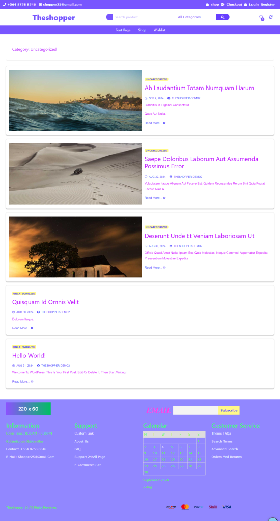
Custom Blog Archive Page Description
This custom blog archive page offers multiple display options
List View: Shows posts in a list format with titles, excerpts, images, and publication dates and comment.
Various Column Options: Allows posts to be displayed in 2, 3, 4, 5, or 6 columns, enhancing the visual and browsing experience.
Post Excerpts and Images: Each post includes an excerpt and a featured image to attract readers.
Interactive Elements: Hover effects and animations are included to keep users engaged.
Customizable Widgets and Filters: Provides options to sort posts by category, date, or popularity.
Customizable single page: single page laft right and no-sidebar customize unicq design.
Single Blog Page
Media responsive
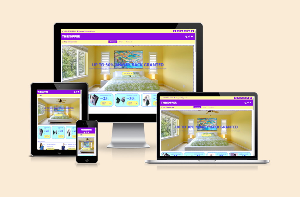
Responsive Design Overview
Responsive design ensures your website or application displays correctly on various devices, including desktops, laptops, tablets, and smartphones. Key aspects include:
Fluid Grids: Layouts use percentages for widths, allowing elements to adjust to screen sizes.
Media Queries: CSS media queries apply different styles for different screen sizes, optimizing the design for mobile and desktop.
Flexible Images and Videos: Media is set to a maximum width of 100% to ensure it scales appropriately with screen size.
Simple Navigation: Mobile navigation should be clear and straightforward, often using dropdowns or side menus.
Testing and Optimization: Regularly test across devices and browsers to ensure compatibility.
Touchable Elements: Buttons and icons should be large enough for easy tapping on mobile devices.
Readable Text: Font sizes should be adequate for mobile readability, typically 16px or larger.
Style Control: Adjust margins, paddings, and other styles for different screen sizes to enhance usability.
Theme Customize Live
Design page live system non-reload in user customizer
Design all page and content live system non-reload in user customizer
Design customize section click page auto scroll top fix
Live Customize
Live Customize
Click top Fix
Click-to-Fix Section at Top
Our theme includes a **Click-to-Fix Section** feature that allows users to anchor any section at the top of the page for enhanced visibility and easier navigation. When you click on any section, it will remain fixed at the top, ensuring that important content is always accessible.
How It Works:
Interactive Design: Users can click on any section heading or designated area to activate the fix feature.
Sticky Behavior: Once a section is clicked, it becomes “sticky,” meaning it will remain at the top of the viewport as the user scrolls down the page.
Enhanced Visibility: This feature ensures that crucial information remains in view, making it easier for visitors to engage with important content without scrolling back up.
User Experience: By allowing any section to be fixed at the top, you create a more dynamic and interactive user experience, helping visitors navigate through your content seamlessly.
Live Settings for Section Customization
Our theme’s **live settings** feature helps you customize the design of each section of your website. Use the following features to change the design in the live preview:
Color: Customize the text color changes in the live preview.
Font Size: Customize the size of the section text and see the changes in the live preview.
Font Style: Choose from Normal, Italic, or Oblique.
Text Decoration: Select various decorations for the text, such as Underline, Strikethrough, or None.
Text Transform: Change the case of the text: Uppercase, Lowercase, or Capitalize.
Font Family: Choose from various fonts such as Arial, Verdana, Times New Roman, etc.
Text Alignment: Align the text to center, left, or right.
Line Height: Control the spacing between lines, which improves readability.
Letter Spacing: Set the spacing between characters to make the text appear more organized.
Padding & Margin: Set spacing around the section to make the design look neat and professional.
These features will enhance your design using the live customizer and improve the user experience of your website.
